Photo by Edwin Andrade on Unsplash
OPENEDU.CH, launched in 2020 by WIKIMEDIA CH, is an open education resource platform with a goal to store content from Wikimedia projects and external teaching materials. As a BI developer/designer, I designed an interactive website in Figma presenting four key features derived from user interviews and testing: the landing page, search results, sign-up, and file sharing. The redesigned website incorporates a clear hierarchy to guide users in finding relevant information, along with a vertical toolbar for filtering search results. In addition, to enable the creation of this platform, a new data model was proposed along with the prototype.
OPENEDU.CH, launched in 2020 by WIKIMEDIA CH, is an open education resource platform. The main goal of this project is address Information overload on the website demotivates users from using the site effectively.
The main goal of this project was to help OPENEDU.CH build an ontology for sorting existing data and providing a data model to store collected content from Wikimedia projects as well as external teaching materials. Additionally, OPENEDU.CH wished to simplify an admin interface, because the current one is complex and requires manual filling of many process for them to verify and manage education materials uploaded by internal or external educators. , which has been frustrating for admin users, and thus, a more user-friendly admin interface is needed.
Other features such as web crawler, and recommender system were also proposed by the organization team. Considering the project scope, legal aspects, and project timeframe, we refined the initial challenges as follows:
To tackle the initial issues, a Double Diamond Process Model is applied, as this model can help the team to better understainf design problems and be also to establish clear communication for deriving solutions. The Double Diamond Process Model consists of four phases: Discover, Define, Develop and Delivery.

In this stage, I worked together with our team to defin the scope of the project and explore problems. Then, I did a compressive analysis include web audit, comapatitive analysis, user reseach to identify the project’s needs, initial problem, target audience and potential improvement.
The current website has a simple design, but it lacks clarity in terms of identifying the main audience and conveying the services, products, and benefits offered by the website. A website audit was conducted to identify the initial challenges, and three main issues were identified:
These challenges need to be addressed to enhance the value, usability, and user experience of the website and improve its effectiveness in serving its target audience.


Open Education Resources (OER) platforms such as Medium, Google Scholar, MIT, OER Commons, BC Campus, and Europeana were chosen for benchmarking due to their similarity in terms of platform type, content, and services offered to OPENEDU.CH. These platforms serve as benchmarks for evaluating and refining the OPENEDU.CH website based on five main criteria: information architecture, navigation, search function, filters, and search results.

A user journey includes needs recognition, exploration, evaluation, decision making, and post-behavior stages. The diagram below maps out critical touchpoints, actions, and emotions of the target personas.

After completing the above analysis, I summarized 5 main business questions that shall be investigated through user interviews:
I have also designed eight sub-questions that are related to the usability and user experience of the current site. At the end of the interview, user testing was given to get a better idea of how users act and feel while they search for educational materials.

Based on the user interviews, the key findings are as follows:
In the define phase, I analysed interview data gathered from previous stage and generated insights to support the team to develop solutions that are feasible and could be developed within project timeline. Additionally, I created two personas and refined the use cases by prioritising the most prominent features that should be developed for for the OPENEDU.CH platform.
To create user persona, understand the root causes, initial needs, and potential opportunities for the target users is very imprortnant for refine the domain of the ontology, because this will not only impact on the design of user interface but also imfuece the beck-end infrastructure and further data strategies.
Here are the personas from my research:

Based on the solutions proposed by the data scientists, these features can be incorporated into the final prototype to create a user-friendly experience that enables users to easily navigate the OPENEDU.CH platform.
When it comes to develop phase, I compared potential solutions and presented to our team so that we can selected the most reasonable ideas to that can move forward. The table gives actions and corresponding technical requirements of selected features.

Designing the user flow is crucial for creating a user-friendly platform. By mapping out the steps for searching and uploading files, I identified potential pain points and areas for improvement. This helped guide the development of the final prototype to ensure ease of use and meet the needs of our target users.

In the design phase, I adopted the Mental Model and Design Principle to guide my design process, with the goal of eliminating obstacles and confusions that users may face when arriving on the website. By designing key user interfaces that are similar to those of its competitors, I aim to create a familiar and intuitive navigation experience for users, allowing them to easily explore the site without hesitation.
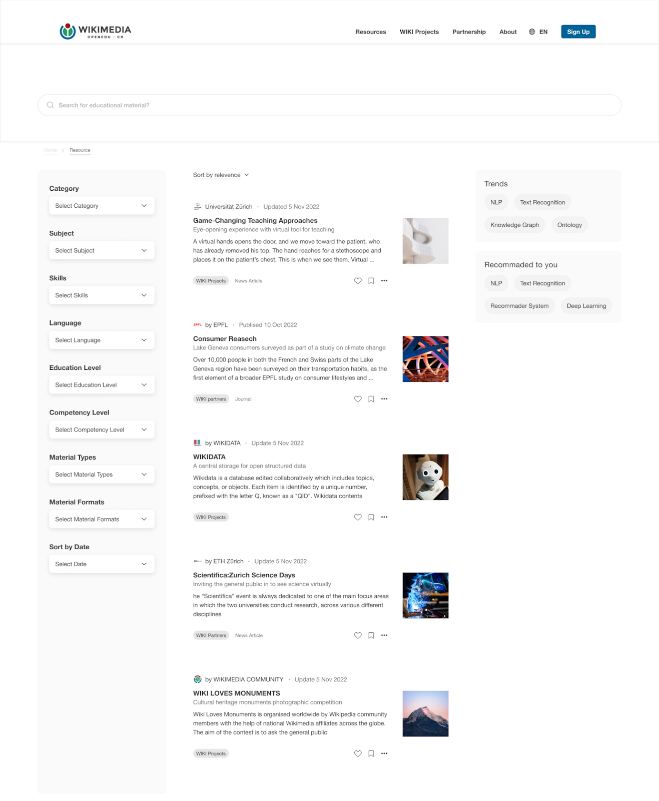
To optimize user experience and site usability, four features have been redesigned in the proposed landing page below:
In the resource page design, key features have been implemented to enhance user experience, including:
These design enhancements aim to improve usability and aesthetics, providing users with a seamless and visually appealing experience on the platform.
On the sign-up page, I expanded data collection beyond name and email fields, using tags and a drop-down menu to simplify the process, encourage user input, and ensure accurate and standardized data for analysis.
I simplified the uploading form and divided the process into four steps, in order to keep the user informed about their current section and enable them to estimate the time needed to complete the task.
A landing page and resource page have been created in Figma. Additionally, three interactive features can be tested in this website prototype:
Best Solution Award 2022 for OpenEdu challenge by Wikimedia CH.
in the last day of the project, our team presented all the solutions, along with a pitch deck to support the launch of these exciting features that we have developed over the past six weeks. The objective of this project is to provide the client with tangible and actionable solutions. Although the redesigned website was not a requirement from the organization, OPENEDU.CH, we believe that having a website prototype that can visualize our solutions is more convincing than simply presenting an NLP model. However, there are some improvements that need to be addressed based on data collection for future development.
Finally, thanks to Women++ deploy(impact), Wikimedia.ch and sponsors Accenture, Aiven, Microsoft, Migros-Genossenschafts-Bund, Constructor Learning, and Thomson Reuters to offer us this great opportunity to work on this amazing project. Check this article (written by Elisangela Merlin) to know more about the work that made us win this exciting data science challenge.

